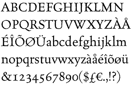
Typography is the art and technique of arranging type to make written language readable and beautiful. The arrangement of type involves selecting typefaces, point size, line length, line-spacing (leading), letter-spacing (tracking), and adjusting the space within letters pairs (kerning).
Printing is a process for reproducing text and images using a master form or template.
As we have covered most of the ancient civilization typography in our lectures, to anyone who did not attend them I recommend to read this article - http://ilovetypography.com/2010/08/07/where-does-the-alphabet-come-from/ as it is very detailed and covers a lot of this topic.
The word typography comes from the Greek typos "form" and γράφειν graphein "to write". One of the first printing techniques was using wooden blocks with letters / symbols carved into them and then pressed against a certain material, the earliest examples of this technique come from China, around 220 B.C.
The first main printing revolution in Europe came with the invention of printing press in 1450 by mr. Gutenberg and his first printed book - The Gutenberg's bible. This invention was so revolutionary mainly because suddenly the production of text was so affordable and easy to do that books became approachable by almost anyone. The lead based alloy principle was so successful that it is still used nowadays. Thanks to this, artist that were painting books by hand became designers who were thinking more about the position of the text, its readability and positioning. It also allowed them to invent new letter forms and typefaces.
 Movable type was already invented in China by By Sheng around the 10th century but it involved porcelain and clay and was not highly usable. Gutenberg was the first one to invent 'movable type' in Europe. It is 'a
process of setting type by hand for printing on a letterpress machine.
The type can be made of either wood or metal and letters were cut
individually by craftsmen called punch cutters. This style of printing
was the first developed that could rapidly, a
relative term, produce multiple copies of lengthy printed materials and
books. It remained the standard printing technique until photo
typesetting came about in the 1950s'.
Movable type was already invented in China by By Sheng around the 10th century but it involved porcelain and clay and was not highly usable. Gutenberg was the first one to invent 'movable type' in Europe. It is 'a
process of setting type by hand for printing on a letterpress machine.
The type can be made of either wood or metal and letters were cut
individually by craftsmen called punch cutters. This style of printing
was the first developed that could rapidly, a
relative term, produce multiple copies of lengthy printed materials and
books. It remained the standard printing technique until photo
typesetting came about in the 1950s'. 

 Eventually, Jenson ended up producing more than 150 titles and inventing few other letter forms including Greek style one and a black-type one (Blackletter, also known as Gothic script, Gothic minuscule, or Textura, was a script used throughout Western Europe from approximately 1150 to well into the 17th century, see below - that is not the actual Jenson's type).
I also find absolutely beautiful that Jenson had his own typographic mark (that you can also see on the right).
 Another important figure of this time was Aldus Manutius who was the inventor of the italic type, the inventor of the modern use of the semicolon (;) and also the developer of the modern look of comma (,). And that is still not all of it. Manutius was a big fan of books and literature in general which lead him to inventing pocket edition of book that were being printed. He was an admirer of Greek and Latin classics and therefore his main task was to make sure those were printed in multiples and could be accessed by everyone who wanted to. In 1501, Aldus began to use, as his publisher's device, the image of a dolphin wrapped around an anchor.
His editions of the classics were so highly respected that almost
immediately the dolphin-and-anchor device was pirated by French and
Italian publishers.
Another important figure of this time was Aldus Manutius who was the inventor of the italic type, the inventor of the modern use of the semicolon (;) and also the developer of the modern look of comma (,). And that is still not all of it. Manutius was a big fan of books and literature in general which lead him to inventing pocket edition of book that were being printed. He was an admirer of Greek and Latin classics and therefore his main task was to make sure those were printed in multiples and could be accessed by everyone who wanted to. In 1501, Aldus began to use, as his publisher's device, the image of a dolphin wrapped around an anchor.
His editions of the classics were so highly respected that almost
immediately the dolphin-and-anchor device was pirated by French and
Italian publishers.The Italian renessaince progressively moved to France where one of the main figures in this field was Claude Garamond who was a publisher and a punch cutter and also the first one to make a business out of printing as a service for others. One of the modern fonts that we still use and that carries his name was heavily influenced by him.

 Another important 18th century French punch cutter and typefounder was Pierre Simon Fournier. One of his contributions to typography was the development of ornaments and decorative features but his main accomplishment is that he ‘created a standardized
measuring system that would revolutionize the typography industry
forever’. The reason that lead him to do this was the fact that in the 1723 the French government decided that all letters have to be subjects to standards. During his life, Fournier also developed an interest in music and when he combined those two passions, it lead to him developeding a new musical typestyle that made the notes round,
more elegant, and easier to read.
Another important 18th century French punch cutter and typefounder was Pierre Simon Fournier. One of his contributions to typography was the development of ornaments and decorative features but his main accomplishment is that he ‘created a standardized
measuring system that would revolutionize the typography industry
forever’. The reason that lead him to do this was the fact that in the 1723 the French government decided that all letters have to be subjects to standards. During his life, Fournier also developed an interest in music and when he combined those two passions, it lead to him developeding a new musical typestyle that made the notes round,
more elegant, and easier to read. 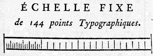
The 18th century was a golden age for typographers, even the Italian ones. There was Giambattista Bodoni who took Fournier as his example but lately, his admiration was focused more on John Baskerville and William Caslon. He and Firmin Didot evolved a style of type called 'New Face', in which the letters are cut in such a way as to produce a strong contrast between the thick and thin parts of their body. Bodoni designed many type-faces, each one in a large range of type sizes. There are modern versions of his typefaces that are carrying his name.

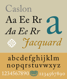
William Calson was an English gunsmith and a designer of typefaces. His typefaces took inspiration of the Dutch Baroque and also inspired John Baskerville. Caslon typefaces were immediately popular and used for many important printed works, including the first printed version of the United States Declaration of Independence. In fact, they have became so popular that the expression about typeface choice, "when in doubt, use Caslon," came about.
Last one of the early typographers was John Baskerville. While being a member of the Royal Society of Arts, he has designed many typefaces along with his punchcutter John Handy. He cooperated with The University of Cambridge and also published a big edition of The Bible. His typefaces were greatly admired by Benjamin Franklin, a printer and fellow member of the Royal Society of Arts, who took the designs back to the newly created United States, where they were adopted for most federal government publishing. More recently, Emigre (states for Emgire magazine that I was talking about in the previous article) modernized his version of Baskerville and gave it a name Mrs Eaves - which as John Baskerville's wife.

I thank very much for help with this article to: http://designishistory.com, http://en.wikipedia.org/wiki/Typography


.jpg)