Thursday, 23 April 2015

Eye Magazine

Recently I have gotten into loving finding out about Graphic Design magazines and if it comes to this topic, Eye Magazine is certainly one of the biggest contemporary influences in this area. With it's recent #85 issue (that you can actually see page by page shown here), colourful design and interesting articles it is also one of the best references and study material a Graphic Design student can find. I also have a soft spot for traditional, real prints and not just internet magazines. But to continue about the Eye magazine...


According to Wikipedia, Eye magazine is
Eye magazine, the international review of graphic design, is a quarterly print magazine on graphic design and visual culture.
It was first published in 1990 and it's founder is no-one else than Rick Poynor who is also the editor of the first 24 issues. He also contributes to the magazine and on its website you can find a part called 'Critique' which contains short articles by Poynor on various different topics. Straight away, the first one is very worth reading as is called Words and Pictures talking.

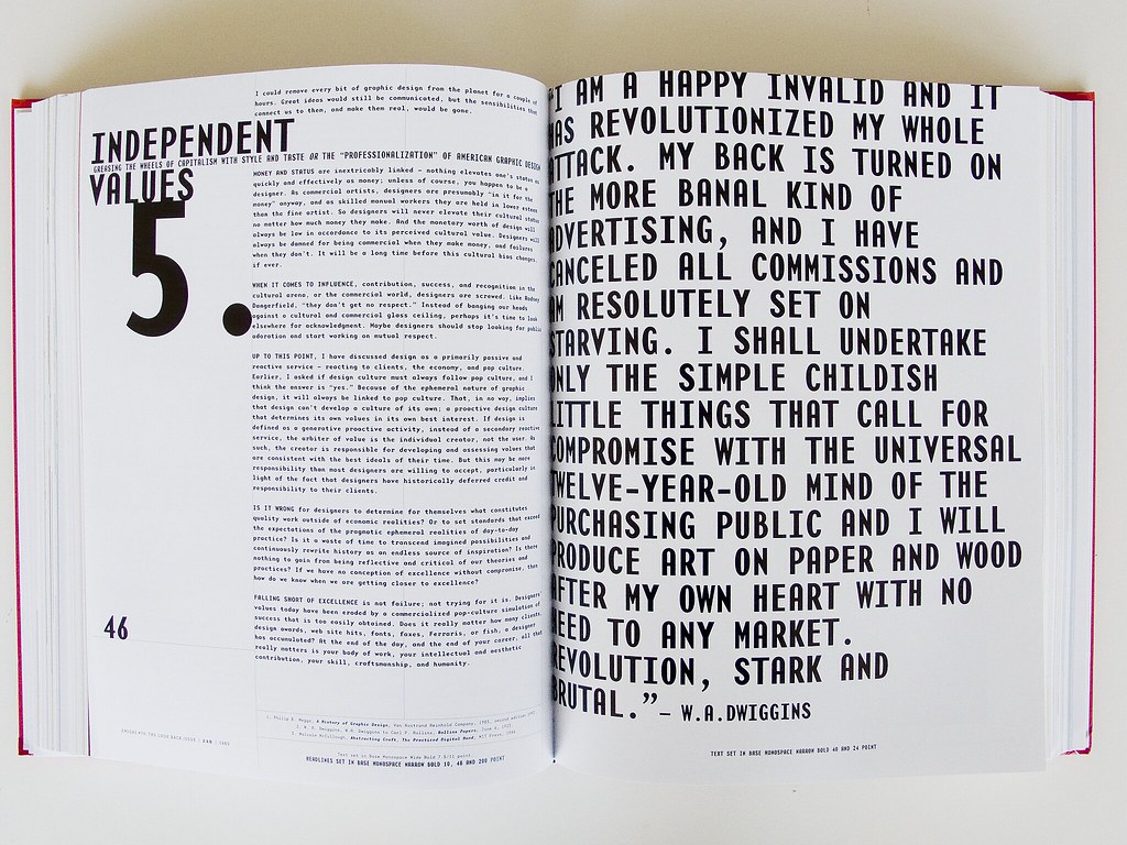
(...I mean, seriously, how can you not like a magazine who has this statement on its pages)

In the case of Eye magazine there is not much to say about its history, the most interesting thing (in my opinion) the covers and content speaks for themselves and have to be discovered by a curious reader. Therefore I've decided to find out a bit more about its contributors.

Let's start with Rick Poynor himself. Rick Poynor is not a Graphic Designer himself but he is more of a glue and initiator of everything that goes around this topic. His main profession is a writer who focuses mostly on visual culture. 

His major works are No more rules, Typography Now: The Next Wave, Typographica and More Dark Than Shark. He was a co-ordinator of First things first 2000 Manifesto initiated by AdBusters and is also a co-founder of Designobserver.com. As well as Eye Magazine he is also a columnist in Print, another of a very high quality reading for designers. 


 Another famous contributor to the Eye Magazine is Stefan Sagmeister who's name you probably could not missed at it is regularly mentioned in those circles. Sagmeister is an Austrian Graphic Designer and Typographer, co-founder of Sagmeister and Walsh. His works contain designing album covers for Lou Reed, Rolling Stones, OK Go, Aerosmith or David Byrne. 

His motto is  "Design that needed guts from the creator and still carries the ghost of these guts in the final execution."

Other of his clients include Guggenheim Museum, HBO and Time Warner.


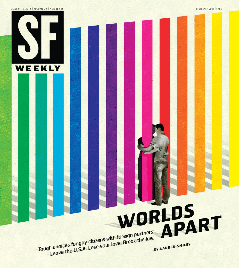
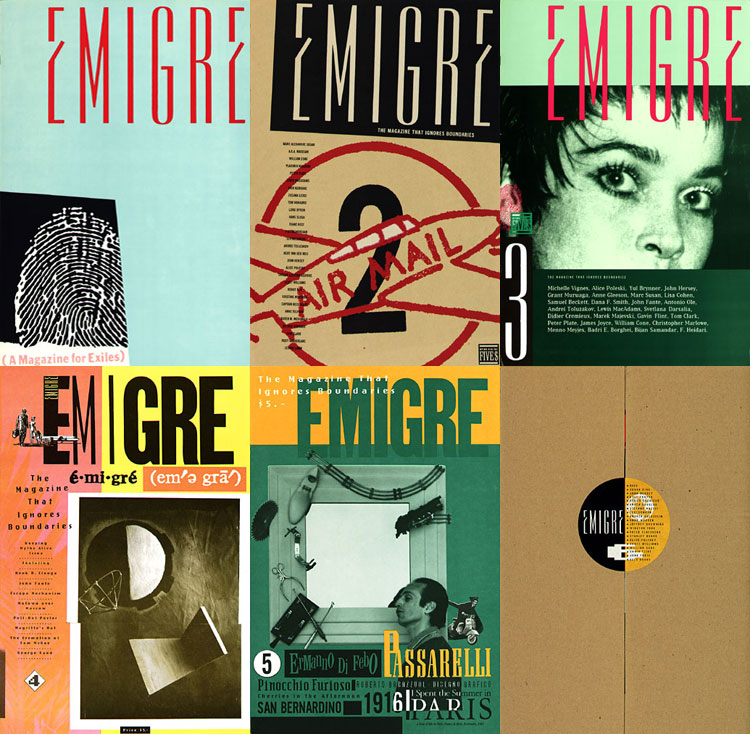
And now to the best bit, these are some covers of the Eye Magazine.


Monday, 20 April 2015

Modern Typography + Its usage

MODERN TYPOGRAPHY

In previous article I have covered the history and the evolution of typography. Now let's move to the recent age where based on all the gathered knowledge, we now have different type classification and typography rules that are the daily bread of a Graphic Designer. 

Type Classification

More details about this so so nicely organized can be find here: designishistory.com/1450/type-classification/

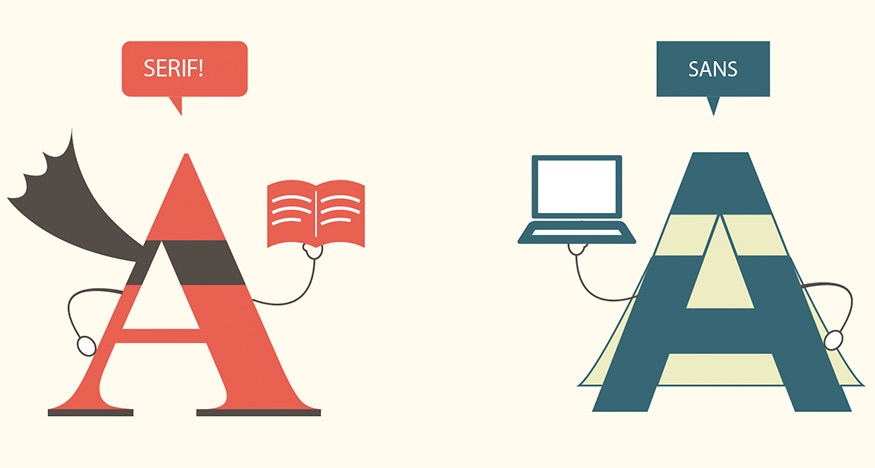
Let's start with the type classification that you probably going to hear as the first thing when starting as a Design student. There are two main types of letters:

1. SERIF: 'In typography, a serif is a small line attached to the end of a stroke in a letter or symbol such as when handwriting is separated into distinct units for a typewriter or typesetter.' Considering the invention of print that I was mentioning previously, serif typefaces were popular much more earlier than sans-serif ones. And it has it's own reason and that is readability. In the days of non-digital era, typography was a field that was dominant mainly in books, later on newspapers where a huge amount of text is sitting on a page. It is much more easier for a human eye to be lead by serifs between the lines.  People often refer to them as feet, although that is in no way a proper anatomical term when referring to typography. 

2. SANS-SERIF: ...surprisingly, the opposite of serif typefaces. Those type of letters were popular in the very beginning, before the invention of printing and had their comeback afterwards, the most in the digital era. They are suitable for headlines or short texts that are eye-catching and also, don't need to look very serious. 


3. SCRIPT: Script typefaces are ornamental, hand-written look-alike typefaces that have mainly decorative purposes. They can be precise or have an intentional rushed look as different hand writing also does. That is why they are divided into Formal and Casual. Formal typefaces are frequently used for invitations and diplomas to effect an elevated and elegant feeling whether Casual typefaces were mainly used for advertising. Because of the decorative element, it was very hard to use them while using a letterpress but with the progress of modern technology, they have became much more popular.


 4. CALLIGRAPHIC: As the name suggests, those types of letters are usually developed from calligraphy which is a type of visual art based on writing. It is using either brush or a dip pen (nowadays preferably with a metal tip). Calligraphy is interesting in the sense that it has a wide and long history both in Western and Eastern civilizations. Those are two examples so you could see the differences. First one is On Calligraphy by Mi Fu, Song Dynasty, second one is Calligraphy in a Latin Bible of 1407. This bible was hand written in Belgium, by Gerard Brils, both images come from Wikipedia.


5. BLACKLETTER:
Possibly because of the Gutenberg's bible, Blackletter stayed a popular typeface in Germany as a reminiscence of the old books for a long time until the 'new wave' when designers started creating the absolute opposite of it - clean, sans-serif, highly geometric letter forms. Its biggest disadvantage is that its older versions contain a high percentage of ligatures (In writing and typography, a ligature occurs where two or more graphemes or letters are joined as a single glyph - or to say it in a more simple way, two letters connected to each other) and therefore can not be easily readable.


 6. PIXEL: ...or Bitmap fonts are digital fonts that use pixels to create letters.


7. DECORATIVE: Decorative fonts are pretty much all the other ones that don't belong into any of the previous groups. Think about fonts that include pictures or are created for a special purpose for example movie titles etc.


TYPOGRAPHIC TERMINOLOGY

Why re-do something that has already been done in an absolutely perfect way? A website called Typedia did an amazing job in simple explanation of Typographic terminology. The article can be found here.


USAGE OF MODERN TYPOGRAPHY IN DESIGN

Just as I was writing this article, I popped on Twitter where I am following Creative Blog noticing that they have written an article about Typography. I very much recommend it and will try to summarize it in here. 
First thing to know when using type in your design is the fact that different fonts have different emotional feelings. And not only fonts. Colour and position also play a massive role. That is why it is important to establish what it is we want to communicate. Do you remember how you feel when someone uses capital letters when they are texting you? Have you ever asked them why are they shouting? That is one of the examples that Creative Review uses:


Although they did not change the colour, in the next example they simply change the position and the font of the word and suddenly, we can tell that the word does feels completely different:


That was the type itself. Next step is to think about your audience or the readers. Because we all come from different backgrounds and different eras, it is only natural that we perceive things slightly differently. Therefore Creative Review suggest to the designers to create a persona of their audience. A simple character that will resemble people who are the most likely to see their typeface and the ones who it is supposed to attract. 

When it comes to judging the aesthetics of the typography, we recommend writing down (or at least reviewing in your head) the top 5 words that immediately come to mind. Make sure it correlates with your audience and design objective, otherwise keep searching.

Another thing to keep in mind is to know what are you designing your typeface for, that is the type of the message it is supposed to carry, readability and legibility of the text.


With thanks to...
http://www.creativebloq.com/typography/how-create-visual-language-through-typography-41514691?page=1
http://designishistory.com/1450/type-classification/
http://designishistory.com/1450/printing-techniques/

Typography and Printing Part I.: History

Because of the lack of knowledge I have in the field of typography and printing and also because recently I have been given a big project that is typography-based I have decided to write one blog only about this topic.


Typography is the art and technique of arranging type to make written language readable and beautiful.  The arrangement of type involves selecting typefaces, point size, line length, line-spacing (leading), letter-spacing (tracking), and adjusting the space within letters pairs (kerning).

Printing is a process for reproducing text and images using a master form or template.
 

As we have covered most of the ancient civilization typography in our lectures, to anyone who did not attend them I recommend to read this article - http://ilovetypography.com/2010/08/07/where-does-the-alphabet-come-from/ as it is very detailed and covers a lot of this topic.
 
The word typography comes from the Greek typos "form" and γράφειν graphein "to write". One of the first printing techniques was using wooden blocks with letters / symbols carved into them and then pressed against a certain material, the earliest examples of this technique come from China, around 220 B.C.
The first main printing revolution in Europe came with the invention of printing press in 1450 by mr. Gutenberg and his first printed book - The Gutenberg's bible. This invention was so revolutionary mainly because suddenly the production of text was so affordable and easy to do that books became approachable by almost anyone. The lead based alloy principle was so successful that it is still used nowadays. Thanks to this, artist that were painting books by hand became designers who were thinking more about the position of the text, its readability and positioning. It also allowed them to invent new letter forms and typefaces.

Movable type was already invented in China by By Sheng around the 10th century but it involved porcelain and clay and was not highly usable. Gutenberg was the first one to invent 'movable type' in Europe. It is 'a process of setting type by hand for printing on a letterpress machine. The type can be made of either wood or metal and letters were cut individually by craftsmen called punch cutters. This style of printing was the first developed that could rapidly, a relative term, produce multiple copies of lengthy printed materials and books. It remained the standard printing technique until photo typesetting came about in the 1950s'.

We tend to think about Graphic Design as a fairly new field of study and also, we tend to think it is mainly digital but this particular age in our history is proof that it is not like that at all. Main designer of this age, after Gutenberg's invention and also his student was Nicholas Jenson, based in Venice in the age of what could be called The Printing / Typographic Italian Renessaince. He was the inventor of the first Roman Type (see left, it is the actual Jenson's type) and who also become a legendary figure between the designers of the 19th century.


Eventually, Jenson ended up producing more than 150 titles and inventing few other letter forms including Greek style one and a black-type one (Blackletter, also known as Gothic script, Gothic minuscule, or Textura, was a script used throughout Western Europe from approximately 1150 to well into the 17th century, see below - that is not the actual Jenson's type).
I also find absolutely beautiful that Jenson had his own typographic mark (that you can also see on the right).


Another important figure of this time was Aldus Manutius who was the inventor of the italic type, the inventor of the modern use of the semicolon (;) and also the developer of the modern look of comma (,). And that is still not all of it. Manutius was a big fan of books and literature in general which lead him to inventing pocket edition of book that were being printed. He was an admirer of Greek and Latin classics and therefore his main task was to make sure those were printed in multiples and could be accessed by everyone who wanted to. In 1501, Aldus began to use, as his publisher's device, the image of a dolphin wrapped around an anchor. His editions of the classics were so highly respected that almost immediately the dolphin-and-anchor device was pirated by French and Italian publishers.

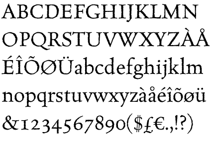
 The Italian renessaince progressively moved to France where one of the main figures in this field was Claude Garamond who was a publisher and a punch cutter and also the first one to make a business out of printing as a service for others. One of the modern fonts that we still use and that carries his name was heavily influenced by him.


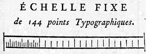
Another important 18th century French punch cutter and typefounder was Pierre Simon Fournier. One of his contributions to typography was the development of ornaments and decorative features but his main accomplishment is that he ‘created a standardized measuring system that would revolutionize the typography industry forever’. The reason that lead him to do this was the fact that in the 1723 the French government decided that all letters have to be subjects to standards. During his life, Fournier also developed an interest in music and when he combined those two passions, it lead to him developeding a new musical typestyle that made the notes round, more elegant, and easier to read.


The 18th century was a golden age for typographers, even the Italian ones. There was Giambattista Bodoni who took Fournier as his example but lately, his admiration was focused more on John Baskerville and William Caslon. He and Firmin Didot evolved a style of type called 'New Face', in which the letters are cut in such a way as to produce a strong contrast between the thick and thin parts of their body. Bodoni designed many type-faces, each one in a large range of type sizes. There are modern versions of his typefaces that are carrying his name.


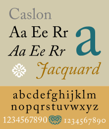
 William Calson was an English gunsmith and a designer of typefaces. His typefaces took  inspiration of the Dutch Baroque and also inspired John Baskerville. Caslon typefaces were immediately popular and used for many important printed works, including the first printed version of the United States Declaration of Independence. In fact, they have became so popular that the expression about typeface choice, "when in doubt, use Caslon," came about.


 Last one of the early typographers was John Baskerville. While being a member of the Royal Society of Arts, he has designed many typefaces along with his punchcutter John Handy. He cooperated with The University of Cambridge and also published a big edition of The Bible. His typefaces were greatly admired by Benjamin Franklin, a printer and fellow member of the Royal Society of Arts, who took the designs back to the newly created United States, where they were adopted for most federal government publishing. More recently, Emigre (states for Emgire magazine that I was talking about in the previous article) modernized his version of Baskerville and gave it a name Mrs Eaves - which as John Baskerville's wife.


 I thank very much for help with this article to: http://designishistory.com, http://en.wikipedia.org/wiki/Typography


Thursday, 9 April 2015

Graffiti design

It is not true to say that I have never come across anyone who would be a part of a graffiti community but I have certainly managed to avoid getting involved in any way and trying it myself. Until I came to New York. Long story short, I have found myself sitting in a flat surrounded by graffiti artist and one of them, finding out that I am a student of Graphic Design, said:

'As a Graphic Designer you will have to start looking at and getting into graffiti at some point. Whether it's going to be out of curiosity and research or a proper involvement, it is inevitable.'

The passion and certainty in his voice triggered my interest and therefore I have decided to write this article about the relationship between Graphic Design and Graffiti.

 (design by Dufranne Thomas)


Graffiti artists and Graphic Designers share some similarities. You can see them doodling in their sketchbooks pretty much 24/7. They are both fans of typography (although designers more in the scientific way instead of the more instinctive one in case of graffiti tags) and bold colours. Both of them are trying to have adrenalin and dynamic nature included in their work and they all experiment with cut outs, collages, printing and spray paints. Yet at the same time they are very far from each other considering their social status.

Graffiti is still persecuted and not accepted by a wide range of society, is still considered being a crime activity. If a graffiti artist would put their work on a poster that he would then stick on a wall, would he become a graphic designer? Quite frankly, I believe so. But that is the beauty, the danger of graffiti that it is out there, whether it is appropriate or not.

For my research (because there is not many actual studies on this topic) I have looked up websites of several Graphic Designers who used to be / are Graffiti artists as well. From what I have seen so far, in most cases, we can see the influence of patterns and perspective in most of them. One of the best websites that clearly showed me the progress of the artist was http://www.neckcns.com which is a website of a German based artist who says: 

'I found that graffiti had become my main interest, so I studied communicational design as a consequence and ended up being a fulltime designer. The result? My graffiti art looks like done by a designer, and my designs definitely still have that graffiti feeling to them. '

Below, there is an example of his work that clearly shows that he there is truth in his words:

Or if you prefer to watch videos, there is a short document called 'From Graffiti Artist to a Graphic Designer' that is definitely worth watching as well. It is aboutMexico City based artist called SEHER who cooperated with companies like BOOM or FUNKO and show his life journey and progress.


I also mentioned the passion for typography in the beginning and while learning about that I have stumbled across an article that has used graffiti influence to push the boundaries of letter design. It claims that something as common as letter forms which we perceive pretty much since we are born can still be done in a different, more intruding way. Here is an example and a link to the whole website.


All in all, I am glad my friend introduced me to the world of graffiti and I will try to go as deep as I can to this culture. Cause by any means, creating tags of your names is in the end.. just a massive fun, right?


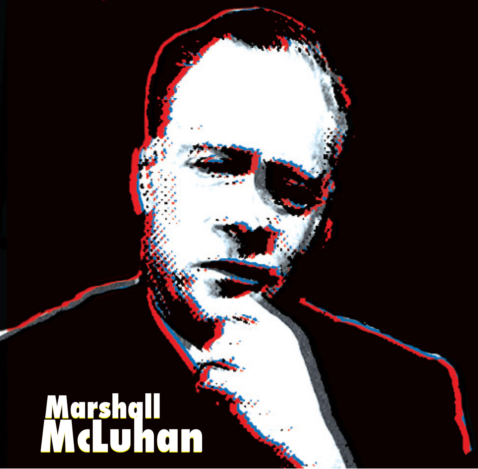
Marshall McLuhan - The medium is the message / massage

'The medium is the message. This is merely to say that the personal and social consequences of any medium - that is, of any extension of ourselves - result from the new scale that is introduced into our affairs by each extension of ourselves, or by any new technology.'

None of the Graphic Designers become what they are without hearing the phrase 'The medium is the message' coined by Marshall McLuhan, a Canadian philosopher of communication theory (how amazing is that?!) with a massive educational background including a degree from Cambridge university. His major work is a book called 'The Mechanical Bride: Folklore of Industrial Man' written in 1964 and is a study of media theory that proposes that the media itself, not their content should be a purpose of interest. 
While doing my research on Wikipedia I have found out an interesting thing that have caught my eye which is McLuhan's example of a light bulb that is supposed to prove the importance of studying the content of a media. Quoted, it goes like this:

 'A light bulb does not have content in the way that a newspaper has articles or a television has programs, yet it is a medium that has a social effect; that is, a light bulb enables people to create spaces during nighttime that would otherwise be enveloped by darkness.'  

Reading this to a person who does not usually come across studies like this, he pointed out an important question which is why is a light bulb a media? That lead me into looking up a definition of the term media itself:

'Media (the plural of medium) are the collective communication outlets or tools that are used to store and deliver information or data.'

In my opinion, people tend to think of the carried information in a more conventional way which would probably be the form of newspaper or a radio. But if we slightly change the way of thinking about this in a more abstract way, radio provides us a sound based information and a light bulb with a visual content that, as McLuhan stated, is influential in a social matter.
Critique has been raised by some philosophers including Umberto Eco and Regis Debray stating that McLuhan uses the term media in a too abstract way making it confusing 'with its use of the media makes of the media an abstract, undifferentiated force and produces its image in an imaginary "public" for mass consumption'.

In part one of this book, McLuhan divides media into two - hot and cold. Hot media, he states, are the ones that require small effort to be perceived ie. movies and cold are the ones that requires more of the consumers attention ie. comics.
In part two, McLuhan analyzed media one by one, mainly its form rather than content as previously stated.
The book also contains McLuhan's most famous pun - Medium is the massage which is a play on words suggesting that we are all stimulated / massaged by media.
Another important term is a 'global village' which is McLuhan's early prediction of World Wide Web and also the Facebook media.
'Global village is created by instant electronic and information movement. It is small as a village but wide as a planet where everybody is maliciously engaged in everybody elses business. The global village is a world where you don't necessarily have a harmony but an extreme concern about everyone else. And much involvement in everybody elses lives.'
To analyze all of McLuhan's work would take certainly longer than one blog post and therefore I recommend this website: Marshall McLuhan Speaks where videos and talks are shown divided into short topics that are relevant to this problematic.


 Graphic Designer Evan Linardi for his final project did a series of typographic posters and one of them was a quote from Marshall McLuhan, the others are of course worth checking out as well:


EMIGRE GRAPHICS


I am not entirely sure how I ran into Emigre design magazine but I do have a suspicion that it was through looking up ZG magazine that I intend to write about later on.
Emigre magazine was a magazine that was actively coming out from 1984 until 2005 and was published by Emigre Graphics company, firstly in San Francisco, California. It's founder is a married couple, a Dutch-born graphic desinger Rudy VanderLans and (close to my heart) Czechoslovakian-born typeface designer Zuzana Ličko, both of them gold medailists of AIGA.


The couple met at University of California, Berkley and started their main project at the time when first Macintosh came out. Some of its imperfections were the impuls for trying to change this and design their own way how to make typefaces more readable. The result of this was Emigre magazine, where Ličko, under the guidance of VanderLans was publishing and advertising her fonts while using the first Macintosh computers. Ličko also ended up redesinging and editing two main fonts Bodoni (Filosofia) and Baskerville (Mrs Eaves) to a more digital friendly version.
The content and form of Emigre magazine has been changed a lot during its lifetime. At first, it was an oversized publication that focused mainly on culture but later on, because of it dynamic aesthetics, it has changed to a more user friendly design that focused on different Graphic Designers and Design itself. From issues 60 to 65 it came out on CD. Nail in the coffin of Emigre Magazine was the fact that nowadays, anyone with personal computer can create a font and US law system does not declare a protection of the authors rights.

The Emigre company is presenting itself as 'the first contemporary type foundry to sell original fonts made on and created for the computer'. It posses over 300 typefaces via various designers.

It is very hard to choose from the best examples of design that Emigre magazine has done so far - therefore I suggest to have a look through it yourself. Nevertheless, here are some of the examples that I have found absolutely stunning.


Monday, 23 March 2015

MoMA, NY part I.


I was not sure whether I will be able to write this post because on one hand, I really wanted to make a research about the beautiful Museum of Modern Art in New York but on the other hand I miss the city so much that every word I write about it is going to be a stab in my heart, hah.
This first part is going to be about my personal relationship with this gallery - what I saw, my photography and favourite pieces. Part two will be more general, about the history and its collections.

First time I've heard about MoMA and also the first time I've visited their website was when I was doing my research about 2001 Space Odyssey and randomly stumbled across a cutlery designed by Arne Jacobsen that Kubrick had chosen for the film:


And therefore I strongly recommend checking out their store to anyone who has a similar obsession with all the artistic merchandise and books.

Usually, I don't look at art on websites of galleries because who does? I think it can be very misleading (meaning that even though you can imagine the size of the pieces, it has never the same effect as if you are standing in front of it, examining carefully every stroke of the brush) so I was very happy that I had the opportunity to visit the actual gallery couple of weeks ago. It was mind blowing.


On the first floor, there was an exhibition that was dedicated to Henri de Toulouse Lautrec (1864 - 1901) who (according to Wikipedia) was a French painter, printmaker, draughtsman and illustrator. His art is mainly focused on bohemian and decadent side of Paris including performances in Moulin Rouge and its famous cancan dancers. Lautrec had a severe physical condition that was stopping him from many activities and was one of the reasons why he started painting. Later on it has led to his severe alcoholism as he was often mocked up for his appearance.


Tolouse-Lautrec's collection contains huge amount of pieces. He created 737 canvases, 275 watercolours, 363 prints and posters, 5,084 drawings, some ceramic and stained glass work, and an unknown number of lost works. He was inspired by Impressionists and Japanese woodcuts that were popular in Paris in his time and also by many of his muses of which one was a famous cabaret singer called Yvette Guilbert. Following photos are not the most significant artworks of his but the ones that I have found the most interesting in the exhibition.


Another thing that caught my eye was a beautiful short animation of a lady performing a dance that makes her dress change its colour every single few seconds.


Another eye catching design had the ZG magazine. This beauty was very hard to research, but I managed to find out that it was a magazine founded by Rosetta Brooks, based in London in 1980 and it is described as a magazine that 'examines various high and low cultures. It features a wide array of themes such as art, society, film, sexuality, visuality, advertisement, body image, science, politics' and has the most disturbing (read amazing) covers you can imagine. Many of the issues and general vibe of the magazine is mentioned in this great article but in short, it was revolutionary because miss Brooks considered the artistic community at the time "a cottage industry protected by a minority group of conservationists" and decided to go against this trend. Maybe something we could think about still? 


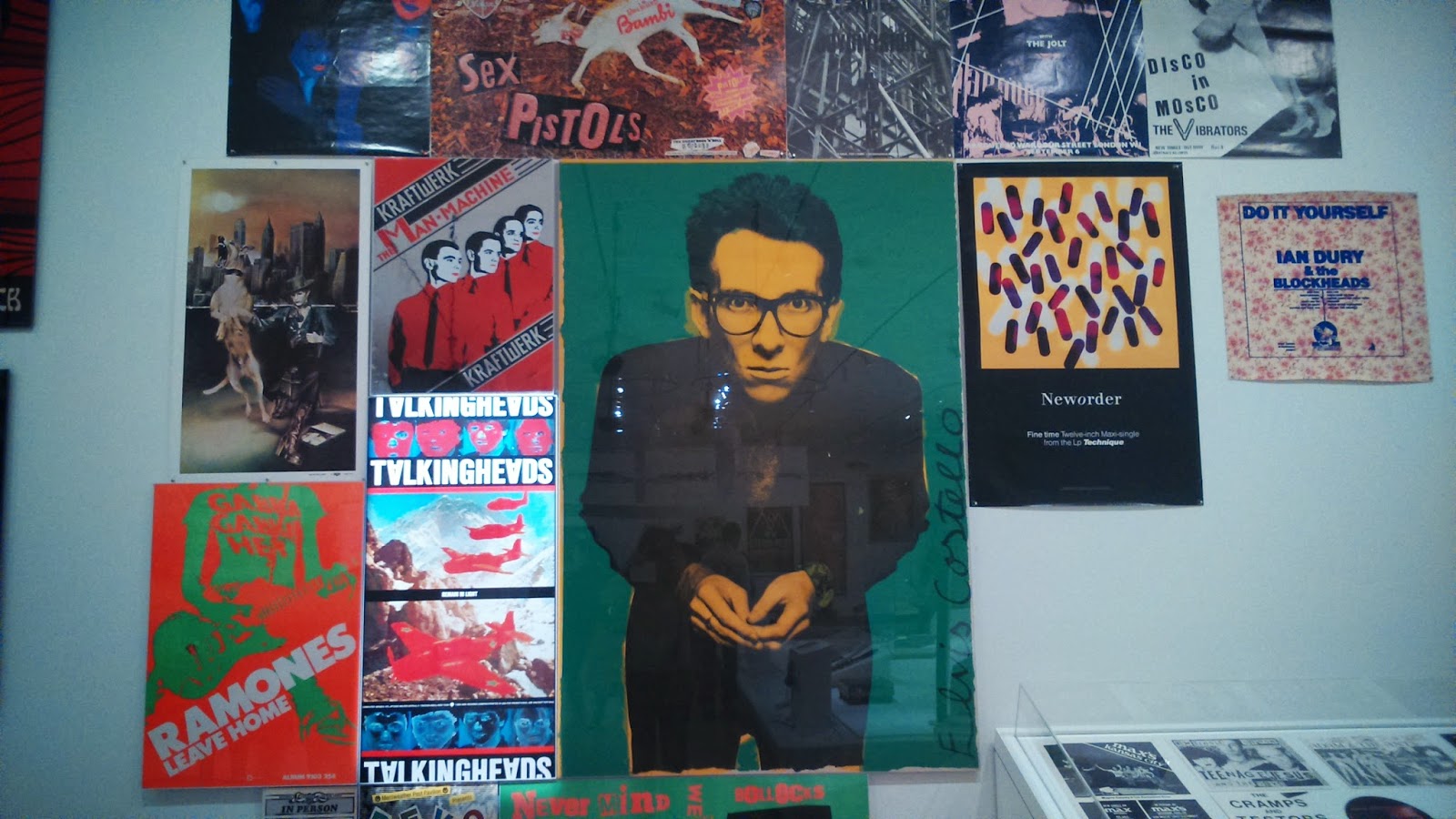
 The music department of MoMA was huge and because the covers are usually inspiring for designers, I ended up taking a peak as well. As you can see on the photos below, it was full with punk and rock bands from the first (or second if we want to be debatable) wave.


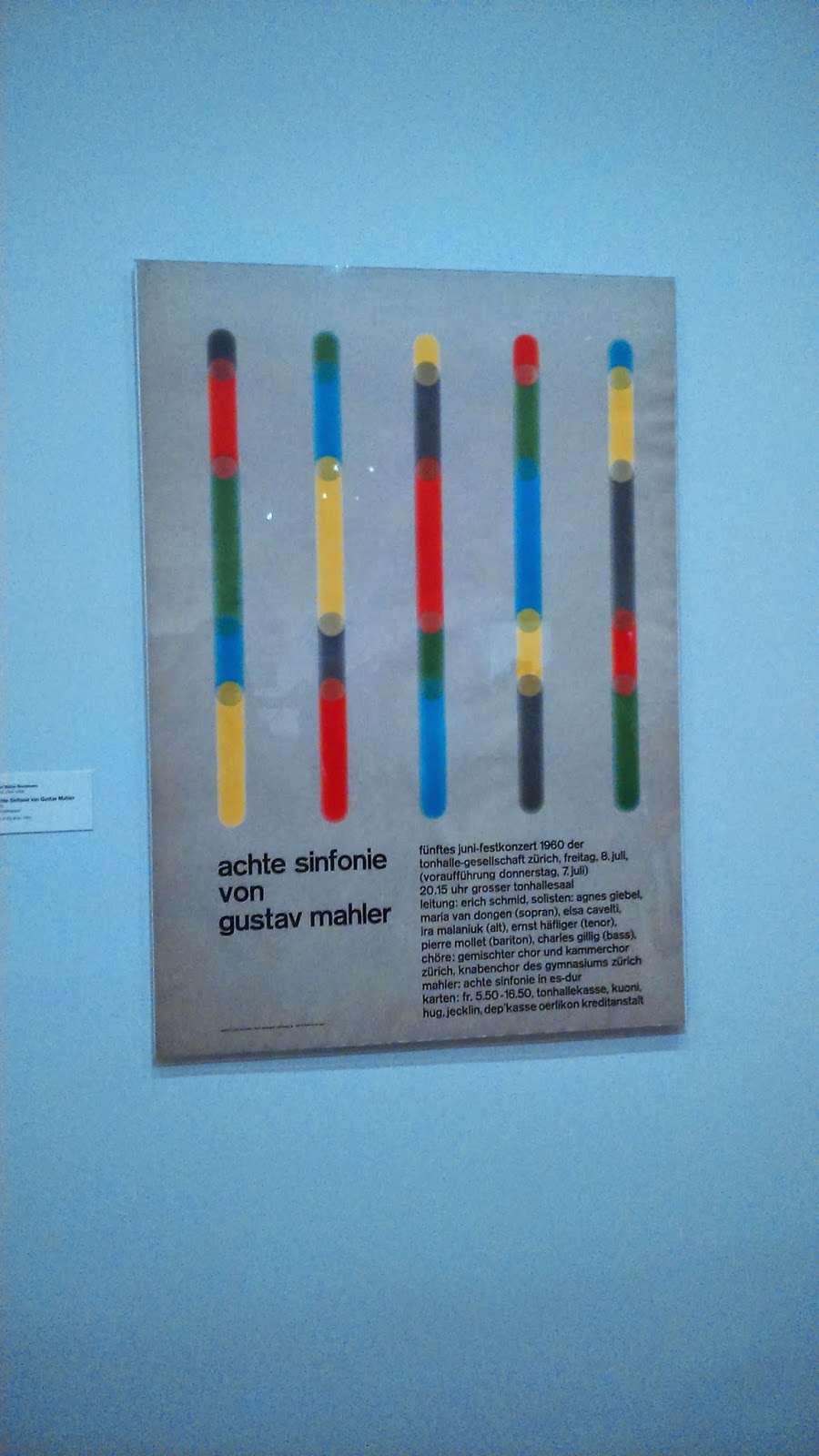
Also I took some photos of posters that I thought had simple but striking design and a clever use of colour.


The time went way too fast in MoMA and therefore I had no more time for going through the actual modern art exhibition but I have decided that I have to go back. For a nice ending of this article, I am adding my favourite pieces from the modern art exhibition - I especially adore the one with busy Jackson Pollock and man in red looking slightly confused.