Wednesday 29 April 2015

The Grid

The Grid. The nemesis of all Graphic Design students. The simple but not so simple rule waiting to be broken. I have decided to write this blog because of several reasons - first one is that I am constantly reminded by my tutors how important it is to use a grid, second is that although I am aware of the basic rules, I haven't managed yet to tight them properly together and understand fully enough so I am in a desperate need of some research. And third is that eventually, this might help some other student who is in the same situation.

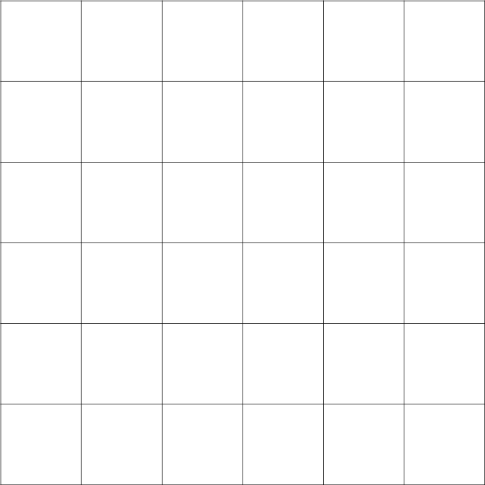
So let's start from the very basic. A grid are horizontal and vertical lines that are going all across your picture. It is a structure that helps designers to organize elements on their layouts according to what is the most pleasant position to the eye, mainly according to the rule of thirds (and I thought I will get rid of geometry if I study Art, hah). A very simple grid is shown below:


Because most designers tend to work with grids using the help of technology (much much easier then to precisely use to ruler every time you need it BUT you could also use a tracing paper), some might think that the grid is a modern invention. Yet, several forms of grid have been around for a long time, some sources claiming that it started being used properly in the 14th century. The main grid that is mentioned from that period of time is called the Villard's diagram and again, is based on the rule of thirds. It looks like this:

Just in case you would not be familiar with this rule - it is a guideline used by photographers, designers and artists that divides an image into 9 squares (two horizontal lines and two vertical). The rule says that your main composition and objects of interest should be always placed into the point where those lines meet. It might be hard to imagine so I am going to borrow a very useful animation from Wikipedia to give you an idea:


As you can see, the horizon is placed on one of the lines and the tree, the main object that catches the observer's eye is placed at the cross. This point is sometimes called the crash point or the power point.

 Asymmetry as a central tenet of modernism


But back to the history. There is another form of grid that is used predominantly in book design and that was popularized by a famous typographer Jan Tschichold which is called Van de Graff system. It is a system based on Gutenberg's and other medieval book maker's principles to make the certain page the most comforting and legible for reading.


And this is how it is created:


The most information and understanding of this I gain from a brilliant article on 99 Designs. They are also recommending to learn couple of terms that are used with grid structure:

Gutter: the space between columns of text
Column inch: a reference to the vertical length of a column of text
Jump: the continuation of a flow of text from the bottom of one column to the top of another, or onto another page
Rail: a thinner column (typically about half the width of the other columns) at the far left or far right of a page, typically providing directory information for, say, a newspaper.
Hang line: like a horizontal rail, this is a line that separates information at the top of a page (such as an image, for example), from the text below, which seems to “hang” from the line
Single column grid: such as what you would find in a typical book
Multi-column (vertical) grid: such as what you would find in a typical newspaper
Modular grid: a grid that involves about as many horizontal divisions as it does vertical ones, making for an especially flexible model of text and image arrangement


In 1919 the Bauhaus movement started in Germany and kept on going until 1933. It was based on the principle to get rid of all decorative elements and focus mainly on the function.

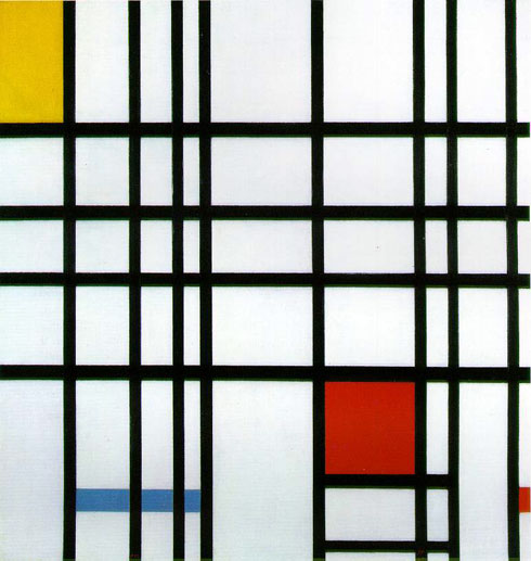
In the 20th century, the grid had become everything. Triggered by Swiss design which had the chance to evolve properly during the war period as Switzerland was a neutral country, even artist start to take everything down to the most pure and abstract form, some of them (Piere Mondrain in this case) even showed the grid itself combined with the colour theory. The main thought of it is the fact that grid was observed not only as a utility but as a form of beauty as well.


To anyone who would like to explore even more about the History of the grid I recommend this article and this article as I have found out many useful information in there.

Considering the actual modern use of the grid. When designing a page it is always useful to work out your layout before actually putting it into the Photoshop via sketching it on paper first. The best thing is to use tracing paper - that way you can move your elements easily and play with options.

There are several types of grid, each one is more suitable for something else and in the end it always depends on your content which one you should use so that's why there are no exact rules to this. But we can still look at the options.

1. Single column grid:
Exactly as it sounds a single column grid is one column of text (image) lies on the page. It is used mainly in book & magazine design. Here is an example of single column grid borrowed from Thinking with type. I am going to use their images to demonstrate what am I talking about as they are the most appropriate and the easiest to understand. When using one column grid on a double page, it is always important to remember that there are two pages facing each other and not design each one separately. That way one can avoid having different outside and inside margins and is also able to get the sense of how the pages respond to each other when viewed by the reader.


2. Multi column grid:

Multi column grid is a type of layout where your text and images are spread into several different lines. There is no limitation to the count of those lines, nevertheless the most common ones are 3 column grids or 5 columns. The general rule is that your publication should stick to the same grid structure (unless there is a reason to not do so) and it should definitely stick to the same grid on each spread. It prevents the piece from looking messy and confusing as the unity is comforting for the viewer's eye. Generally, this type of grid is more useful for publication that include images which (and that is also important) does not necessarily have to stick to one column (as it is shown with the image on the right side). Also, not all of the columns have to be filled with space, it is more pleasing to the eye to leave some negative space so the page doesn't look too crowded and too heavy.


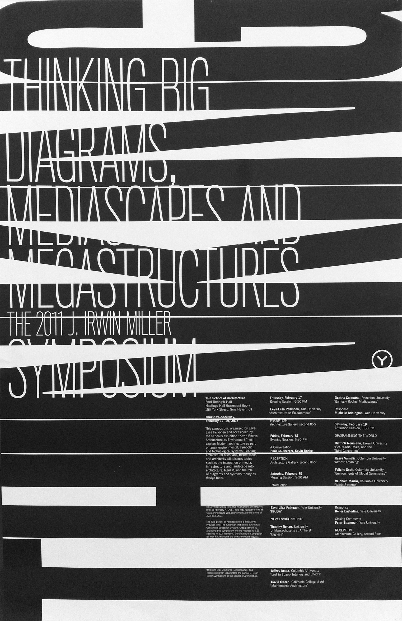
3. Hang Line and The Modular Grid

Hang line is a horizontal line that is coming through your columns. There can be one or there can be multiple of them, the possibilities are endless. As Thinkingwithtype states, the hang line can help you reserve some space for images. The text then 'hangs' down from them.


When there is more than one hang line, this type of grid is called modular. This type of grid was used and explored mainly by Swiss designers in the 1960s. Here is an example:


Those are examples of the main types of grids and here is some of my favourite usage of them:


Tuesday 28 April 2015

The Dark Art

I am aware that this is not strictly design post but even inspiration counts so I have decided to make a blog about two of my favourite artists that do a bit of a dark, fantasy art that I have stumbled across.

 The Dark Art

H R Giger 

Hans Rudi Giger was a Swiss surrealist painter, sculptor, set designer and the famous creator of 'Alien'. His work plays mainly with the concept of robotics and bio-mechanics by which, in this context, I mean combining the parts of human body with technology. This concept is most likely based on the fact that Giger's father was a pharmacist who did not believe that Art could be a profitable field and forced Giger into studying pharmacy when he was younger. Yet, according to Wikipedia, he moved in 1962 to Zürich, where he studied Architecture and industrial design at the School of Applied Arts until 1970. 

In many ways is Giger's style different from other artists. One of the main thing that fascinates me is the fact that (although he started with ink and oil paints which he eventually returned to) he was using predominantly airbrush to create his paintings. If you have never heard of airbrush and don't know how it is used, I strongly recommend to watch this video.


His most famous painting that inspired Alien is called Necronom IV and also won Giger an Oscar looks like this:


Giger also worked on a design for Brian Herbet's cult scifi novel 'Dune' that was supposed to be directed by Jodorowsky and then by David Lynch. Eventually, Lynch has started working on the Dune using only a rough sketch of Giger's design but as Giger stated in one of his books, he wished to work with Lynch and admired his work, especially Eraserhead. 


One of my favourite facts about Giger is that one of his sweethearts was a Swiss stage actress called Li Tobler. Her and Giger had the most romantic relationship. They both used to live together in the attics of condemned houses and using drugs. Eventually, their relationship became open mainly from Li's side and she even left Giger for a short period of time to move to San Francisco with her new boyfriend. After a month, she's returned, disappointed and depressed and shortly after that, she decided to commit a suicide. Li was the model of Giger's most famous series of paintings.


Zdzisław Beksiński


It is so hard to choose the greatest pictures of Zdzisław Beksiński, an artist who inspired me to write this whole article. He is particularly interesting considering the fact that he never studied any Art whatsoever and even refused to visit any exhibition or museums. He also claimed never to be influenced by any cinema or literature. 


Beksiński was born in Poland in 1929 where he also studied Architecture. After short period of time when he worked in that field, he realized that job was not for him and decided to make a living out of his biggest interest - painting. Using mainly oil paint on his own, homemade boards, he started creating artwork that was, according to his own words in 'Baroque' or 'Gothic' manner. 


In general, Beksiński's art can be divided into two periods which first of them (as described on Wikipedia) is more utopian realism with expressionistic colour and second with more abstract style. Oddly enough, Beksiński have always refused to give any explanation on his art (although he once mentioned that he does not see his art as too depressing, sometimes even more humorous than anything else) and he's also decided to not name any of his paintings. Once, he burned some of his pieces in his backyard, claiming that it was either too personal or not perfect enough to be shown to the public.

Appropriation of one of his paintings - 'The Beksiński's Cross' has been used at the famous festival Burning man.


In terms of personal life, Beksiński had to go through one of the most devastating events - surviving his own child as his son commit suicide. He himself was murdered in 2005 by a teenager after he refused to lend him money. He was found in his flat with 17 stabs in his body.

Pick Me Up Graphics Art festival

In terms of Graphic Design and Art festivals, London is certainly of the best places to be. With its London Art Fair, Serpentine Gallery pavilions, The London Design Festival and Pick Me Up it is the city of never-ending possibilities and inspiration. I strongly recommend following all of those on social media (preferably Twitter) to not miss anything or another tip is to follow Eye Magazine's events on this address: http://www.eyemagazine.com/events.

PICK ME UP

Dates:  23 April – 4 May 2015
Open: Daily 10am-6pm, late night Wednesdays & Thursdays until 10pm
Address:  Embankment Galleries, Somerset House, Strand, London, WC2R 1LA
Admission: £10, concessions £8, Festival pass £17.50

It is now the #6th year of Pick Me Up festival that connects all the young designers and illustrators under the roof of Somerset house.

The queue that I have had to go through made me realize how popular Graphic Design and Illustration have become over the past years and it was both terrifying (in terms of competition) and exciting (in terms of appreciation) to see interactions of artists and visitors. The whole event consists from an exhibition on the lower floor and workshops and talks on the upper floor.

My first steps lead me upstairs, so I have been browsing around little, slightly overpriced, shops of which some had truly amazing pieces of design. My favourite one were tarot cards with different typography on each one of them.


 But otherwise, I was a bit disappointed. Yes, there was loads of cats for cat lovers, loads of 'hipster design' with deers, foxes and triangles but this all had lost its excitement for me. On the other hand, I understand that if a small company wants to push through and make a name, it simply has to satisfy the demand of the market and I have to say, there was a lot of people around all the cashier's stools.


I don't want to complain too much though and I have to admit, there was certainly a part that I have enjoyed very much which was the workshops. There was a huge variety of them, you had an option to take a photo of yourself and then adjust it with colourful pens and scratches, lots of printmaking combined with typography workshops and also one that I have spent the most time playing with - scratch art. A workshop surrounded by black walls with a table in the middle and people peaking behind the shoulders of the ones sitting at it was called #blickscratchart and provided the possibility to take a piece of black paper and a plastic stick with a sharp end. As you were scratching the black bit off, the colours of rainbow appeared, giving your message a very funky and eye catching mood. I did have a go with my logo:


When I tried to find out about the technique used on this paper, I was told that the studio simply bought those scratch papers on Amazon which was a slight disappointment. They also told me thought that it is possible to make at home - simply just take wax crayons and paint your base layer and then paint with black acrylic over them.

One last photo from the upstairs is a print by Pocko that actually made me giggle out loud.


 The downstairs exhibition was quite small nevertheless there were some interesting things to look at. The only thing I have lacked was the consistency, something that would bond those pieces together. There was an example of beautiful 3D printed dinosaur figures by Jack Cunningham...


...papercraft by Hattie Newman...

 ...sketches by Zoe Taylor...


and probably the most memorable and striking illustration by French artist Thomas Lamadieu.


All in all, it was great to see what is trendy and new at the moment and get some new inspiration. I am also thinking about attending one of the talks as there was none going on at the time of my visit.


Thursday 23 April 2015

Michael Bierut

Michael Bierut is an American Graphic Designer, a member of AIGA and Pentagram who's work is predominantly typographic. Even though when you Google his name and the work he's done it is predominantly black and white and also typographic, it still manages to be absolutely striking, playful and clever at the same time. Let me show you what I mean...


Bierut was born in 1957 and as many of other Designers he started with album covers. He studied graphic design at the University of Cincinnati's College of Design, Architecture, Art and Planning and since 1990 he is the member of Pentagram where 'is responsible for leading a team of graphic designers who create identity design, environmental graphic design and editorial design solutions'. He posses several Graphic Design awards and is a regular contributor to the Design Observer Magazine (which includes other famous figures, ie. Rick Poynor). After finishing his studies, Bierut was lucky and competent enough to get a job at Vignelli Associates which is an Italian Design company found by Massimo and Lella Vignelli. They are both very good designers themselves and their work includes cooperation with American Airlines, Bloomingdale's, IBM or redesigning New York Subway City map about which Bierut himself said: 'It seemed to me that the whole city of New York was a permanent Vignelli exhibition. To get to the office, I rode in a subway with Vignelli-designed signage, shared the sidewalk with people holding Vignelli-designed Bloomingdale’s shopping bags, walked by St. Peter’s Church with its Vignelli-designed pipe organ visible through the window. At Vignelli Associates, at 23 years old, I felt I was at the center of the universe.'
Massimo Vignelli died last year in May but before that, he published the Vignelli Cannon (also as a free e-book here which he described as his legacy dedicated to young designers).

.

 While researching more about mr. Bierut, I have stumbled across a video that perfectly explains why is he one of the best designers. The video can be found here - it is called 5 Rules form 56 Notebooks. Below this text, you can see the five principles that he talks about summarized into rules.


As you can see, they are all slightly different than everything you'll hear at Design schools but they all make sense. Also, I still think that kindness of a human being is one of the most important things and I absolutely adore that Michael Bierut never forgets this. 


Last thing that I would recommend is taking a look on Bierut's portfolio, both the current and the old one. To see the progress and to know that even the most famous designer had to start somewhere is amazing and definitely very motivating.