MODERN TYPOGRAPHY
In previous article I have covered the history and the evolution of typography. Now let's move to the recent age where based on all the gathered knowledge, we now have different type classification and typography rules that are the daily bread of a Graphic Designer.
Type Classification
More details about this so so nicely organized can be find here: designishistory.com/1450/type-classification/
Let's start with the type classification that you probably going to hear as the first thing when starting as a Design student. There are two main types of letters:
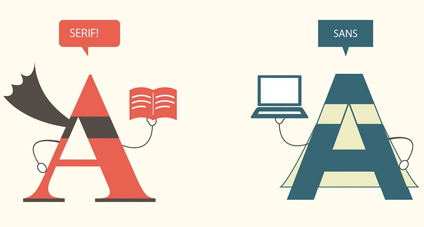
1. SERIF: 'In typography, a serif is a small line attached to the end of a stroke in a letter or symbol such as when handwriting is separated into distinct units for a typewriter or typesetter.' Considering the invention of print that I was mentioning previously, serif typefaces were popular much more earlier than sans-serif ones. And it has it's own reason and that is readability. In the days of non-digital era, typography was a field that was dominant mainly in books, later on newspapers where a huge amount of text is sitting on a page. It is much more easier for a human eye to be lead by serifs between the lines. People often refer to them as feet, although that is in no way a proper anatomical term when referring to typography.
2. SANS-SERIF: ...surprisingly, the opposite of serif typefaces. Those type of letters were popular in the very beginning, before the invention of printing and had their comeback afterwards, the most in the digital era. They are suitable for headlines or short texts that are eye-catching and also, don't need to look very serious.

4. CALLIGRAPHIC: As the name suggests, those types of letters are usually developed from calligraphy which is a type of visual art based on writing. It is using either brush or a dip pen (nowadays preferably with a metal tip). Calligraphy is interesting in the sense that it has a wide and long history both in Western and Eastern civilizations. Those are two examples so you could see the differences. First one is On Calligraphy by Mi Fu, Song Dynasty, second one is Calligraphy in a Latin Bible of 1407. This bible was hand written in Belgium, by Gerard Brils, both images come from Wikipedia.


5. BLACKLETTER:
Possibly because of the Gutenberg's bible, Blackletter stayed a popular typeface in Germany as a reminiscence of the old books for a long time until the 'new wave' when designers started creating the absolute opposite of it - clean, sans-serif, highly geometric letter forms. Its biggest disadvantage is that its older versions contain a high percentage of ligatures (In writing and typography, a ligature occurs where two or more graphemes or letters are joined as a single glyph - or to say it in a more simple way, two letters connected to each other) and therefore can not be easily readable.

6. PIXEL: ...or Bitmap fonts are digital fonts that use pixels to create letters.
7. DECORATIVE: Decorative fonts are pretty much all the other ones that don't belong into any of the previous groups. Think about fonts that include pictures or are created for a special purpose for example movie titles etc.

TYPOGRAPHIC TERMINOLOGY
Why re-do something that has already been done in an absolutely perfect way? A website called Typedia did an amazing job in simple explanation of Typographic terminology. The article can be found here.
USAGE OF MODERN TYPOGRAPHY IN DESIGN
Just as I was writing this article, I popped on Twitter where I am following Creative Blog noticing that they have written an article about Typography. I very much recommend it and will try to summarize it in here.
First thing to know when using type in your design is the fact that different fonts have different emotional feelings. And not only fonts. Colour and position also play a massive role. That is why it is important to establish what it is we want to communicate. Do you remember how you feel when someone uses capital letters when they are texting you? Have you ever asked them why are they shouting? That is one of the examples that Creative Review uses:

Although they did not change the colour, in the next example they simply change the position and the font of the word and suddenly, we can tell that the word does feels completely different:

That was the type itself. Next step is to think about your audience or the readers. Because we all come from different backgrounds and different eras, it is only natural that we perceive things slightly differently. Therefore Creative Review suggest to the designers to create a persona of their audience. A simple character that will resemble people who are the most likely to see their typeface and the ones who it is supposed to attract.
When it comes to judging the aesthetics of the typography, we recommend
writing down (or at least reviewing in your head) the top 5 words that
immediately come to mind. Make sure it correlates with your audience and
design objective, otherwise keep searching.
Another thing to keep in mind is to know what are you designing your typeface for, that is the type of the message it is supposed to carry, readability and legibility of the text.
With thanks to...
http://www.creativebloq.com/typography/how-create-visual-language-through-typography-41514691?page=1
http://designishistory.com/1450/type-classification/
http://designishistory.com/1450/printing-techniques/
No comments:
Post a Comment