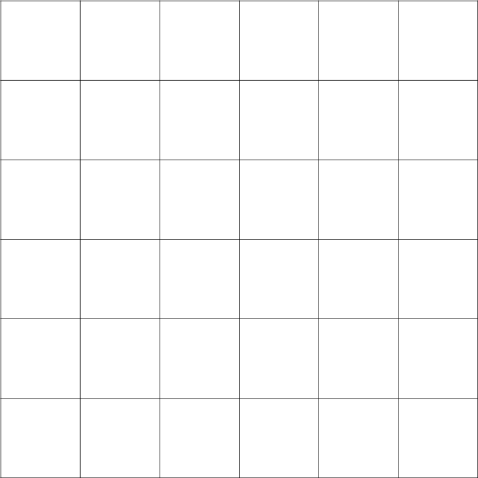
So let's start from the very basic. A grid are horizontal and vertical lines that are going all across your picture. It is a structure that helps designers to organize elements on their layouts according to what is the most pleasant position to the eye, mainly according to the rule of thirds (and I thought I will get rid of geometry if I study Art, hah). A very simple grid is shown below:
Because most designers tend to work with grids using the help of technology (much much easier then to precisely use to ruler every time you need it BUT you could also use a tracing paper), some might think that the grid is a modern invention. Yet, several forms of grid have been around for a long time, some sources claiming that it started being used properly in the 14th century. The main grid that is mentioned from that period of time is called the Villard's diagram and again, is based on the rule of thirds. It looks like this:


As you can see, the horizon is placed on one of the lines and the tree, the main object that catches the observer's eye is placed at the cross. This point is sometimes called the crash point or the power point.
Asymmetry as a central tenet of modernism
But back to the history. There is another form of grid that is used predominantly in book design and that was popularized by a famous typographer Jan Tschichold which is called Van de Graff system. It is a system based on Gutenberg's and other medieval book maker's principles to make the certain page the most comforting and legible for reading.

And this is how it is created:

The most information and understanding of this I gain from a brilliant article on 99 Designs. They are also recommending to learn couple of terms that are used with grid structure:
Gutter: the space between columns of text
Column inch: a reference to the vertical length of a column of text
Jump: the continuation of a flow of text from the bottom of one column to the top of another, or onto another page
Rail: a thinner column
(typically about half the width of the other columns) at the far left or
far right of a page, typically providing directory information for,
say, a newspaper.
Hang line: like a
horizontal rail, this is a line that separates information at the top of
a page (such as an image, for example), from the text below, which
seems to “hang” from the line
Single column grid: such as what you would find in a typical book
Multi-column (vertical) grid: such as what you would find in a typical newspaper
Modular grid: a grid that
involves about as many horizontal divisions as it does vertical ones,
making for an especially flexible model of text and image arrangement
In 1919 the Bauhaus movement started in Germany and kept on going until 1933. It was based on the principle to get rid of all decorative elements and focus mainly on the function.
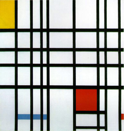
In the 20th century, the grid had become everything. Triggered by Swiss design which had the chance to evolve properly during the war period as Switzerland was a neutral country, even artist start to take everything down to the most pure and abstract form, some of them (Piere Mondrain in this case) even showed the grid itself combined with the colour theory. The main thought of it is the fact that grid was observed not only as a utility but as a form of beauty as well.

To anyone who would like to explore even more about the History of the grid I recommend this article and this article as I have found out many useful information in there.
Considering the actual modern use of the grid. When designing a page it is always useful to work out your layout before actually putting it into the Photoshop via sketching it on paper first. The best thing is to use tracing paper - that way you can move your elements easily and play with options.
There are several types of grid, each one is more suitable for something else and in the end it always depends on your content which one you should use so that's why there are no exact rules to this. But we can still look at the options.
1. Single column grid:
Exactly as it sounds a single column grid is one column of text (image) lies on the page. It is used mainly in book & magazine design. Here is an example of single column grid borrowed from Thinking with type. I am going to use their images to demonstrate what am I talking about as they are the most appropriate and the easiest to understand. When using one column grid on a double page, it is always important to remember that there are two pages facing each other and not design each one separately. That way one can avoid having different outside and inside margins and is also able to get the sense of how the pages respond to each other when viewed by the reader.

2. Multi column grid:
Multi column grid is a type of layout where your text and images are spread into several different lines. There is no limitation to the count of those lines, nevertheless the most common ones are 3 column grids or 5 columns. The general rule is that your publication should stick to the same grid structure (unless there is a reason to not do so) and it should definitely stick to the same grid on each spread. It prevents the piece from looking messy and confusing as the unity is comforting for the viewer's eye. Generally, this type of grid is more useful for publication that include images which (and that is also important) does not necessarily have to stick to one column (as it is shown with the image on the right side). Also, not all of the columns have to be filled with space, it is more pleasing to the eye to leave some negative space so the page doesn't look too crowded and too heavy.

3. Hang Line and The Modular Grid
Hang line is a horizontal line that is coming through your columns. There can be one or there can be multiple of them, the possibilities are endless. As Thinkingwithtype states, the hang line can help you reserve some space for images. The text then 'hangs' down from them.

When there is more than one hang line, this type of grid is called modular. This type of grid was used and explored mainly by Swiss designers in the 1960s. Here is an example:


Those are examples of the main types of grids and here is some of my favourite usage of them:


No comments:
Post a Comment